Thoughts on the new Quora app
The new Quora app for iOS 7 was fully redesigned to take advantage of the new navigation paradigm offered by the new OS. It’s beautiful and the new navigation is really interesting.
Some changes, however, were perhaps slightly too radical.
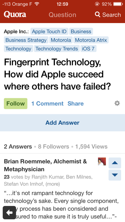
• It is not clear that the Quora button on the top-left corner is a navigation button. Its position might reveal its purpose, but maybe there should be an indication that this button is tappable.

• When you tap on a question, the back button now is on the bottom-left corner which is rather unintuitive. You can however swipe from left to right to go back.

So, Quora Product team, if by any chance you are seeing this, explain these changes.

